Responsive Layouts show up blank when Printing

Use this board to ask questions or have discussions with other Rich Displays users.
Post Reply
fcalizo
New User
Posts: 10
Joined: Tue Oct 09, 2018 4:34 pm
First Name: Francis
Last Name: Calizo
Company Name: Banyan Air
Contact:

Responsive Layouts show up blank when Printing

Post by fcalizo »

Hi all,

I've run into an issue when I try to print out a screen that I've created in PUI Visual Designer.

Whether I'm using Chrome or Firefox, if the screen that I have has a responsive layout being used, the content inside that responsive layout is not shown when I try print that screen on the browser. However, any content outside the responsive layout is being printed.

Most of the screens created for our users involve designing with responsive layouts and the only way I have have them print the screen is through a manual screenshot to the computer and print from there, which is a bit tedious.

First Picture is a screenshot of the webpage, the second picture is a print preview if I try to print that page.


Image


Image
fcalizo
New User
Posts: 10
Joined: Tue Oct 09, 2018 4:34 pm
First Name: Francis
Last Name: Calizo
Company Name: Banyan Air
Contact:

Re: Responsive Layouts show up blank when Printing

Post by fcalizo »

I ended up finding a workaround if anyone else is struggling with this.

I found an NPM package called html2canvas. The script allows me to scan the DOM for elements of my choosing and renders them out as a canvas via a promise. Using the toDataURL() method on a canvas element, I get the base64 String, which can be used in the SRC property of an image. So the steps taken are:

1) I render the div with id of #pui (which is the whole screen)
2) Get the base64 string of the canvas and create an image
3) Write that image to a new browser tab
4) Automatically print the window upon loading

I basically just put this all in a "Print" Button on the page and have the following code in the onClick method:

Code: Select all

html2canvas(getObj('pui')).then(canvas=> {
  let printWindow = window.open("")
  
  printWindow.document.write(`<img src='${canvas.toDataURL()}'>`)
  printWindow.document.close();
  printWindow.focus();
  printWindow.print();
});
User avatar
matt.denninghoff
Profound Logic Staff Member
Posts: 115
Joined: Wed Feb 10, 2016 3:53 pm
First Name: Matthew
Last Name: Denninghoff
Company Name: Profound Logic Software
State / Province: Ohio
Country: United States
Contact:

Re: Responsive Layouts show up blank when Printing

Post by matt.denninghoff »

If you look at the default CSS rules that define responsive layouts, it should be clear why the layouts don't work for printing:
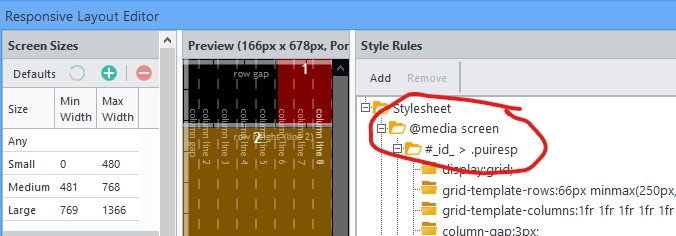
Annotation 2020-03-04 093347.jpg
Annotation 2020-03-04 093347.jpg (49.36 KiB) Viewed 701 times
. The rules are grouped under

Code: Select all

@media screen {}
CSS media selectors, meaning the rules only apply when the display medium is a screen. The Responsive Layout uses media selectors because there may be rules for different screen sizes.

In order to see things when printing, you could do one of these two:
1. you could manually edit the style rules in Visual Designer by selecting the layout and right-clicking on "style rules", and choosing "Open in Editor...".
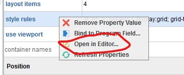
Annotation 2020-03-04 094109.jpg
Annotation 2020-03-04 094109.jpg (17.57 KiB) Viewed 701 times
Then remove the

Code: Select all

@media screen {
and then remove the corresponding closing bracket. You could also copy the text and paste it into a better CSS text editor, edit it, and paste the changes back. This can be tricky if you have many rules. Also, this approach assumes that you have a default screen (that has no widths specified), and the default screen is how you want the layout to appear when printing--and that is probably not the case because screens tend to be wider than paper.

2. Add a global, default set of CSS rules for responsive layouts that would cause things to appear when printing anything in responsive layouts. The layout would not look the same as your screen, but it would appear. Something like this:

Code: Select all

@media print {
  .puiresp {
    width: 100%;
    height: 100%;
    display: grid;
  }

  .puiresp>div {
    min-height: 50px;
    min-width: 50px;
    overflow: auto;
  }

  /* Overrule the absolute positioning of any widget's main tag if it's directly in container. */
  .puiresp>div>[id] {
    position: static !important;
  }

  /* Make the rows stack on top of each other. (Supports up to 15 rows.) */
  .puiresp>div:nth-of-type(1) { grid-row: 1; }
  .puiresp>div:nth-of-type(2) { grid-row: 2; }
  .puiresp>div:nth-of-type(3) { grid-row: 3; }
  .puiresp>div:nth-of-type(4) { grid-row: 4; }
  .puiresp>div:nth-of-type(5) { grid-row: 5; }
  .puiresp>div:nth-of-type(6) { grid-row: 6; }
  .puiresp>div:nth-of-type(7) { grid-row: 7; }
  .puiresp>div:nth-of-type(8) { grid-row: 8; }
  .puiresp>div:nth-of-type(9) { grid-row: 9; }
  .puiresp>div:nth-of-type(10) { grid-row: 10; }
  .puiresp>div:nth-of-type(11) { grid-row: 11; }
  .puiresp>div:nth-of-type(12) { grid-row: 12; }
  .puiresp>div:nth-of-type(13) { grid-row: 13; }
  .puiresp>div:nth-of-type(14) { grid-row: 14; }
  .puiresp>div:nth-of-type(15) { grid-row: 15; }
}
The advantage to this is that it requires no changes to individual display files, and each block will be visible. The disadvantage is that things will not appear how you designed them. Put them in a .css file under /www/<yourinstancename>/htdocs/profoundui/userdata/custom/css/.

I think those @media print rules need to be added to the default Profound UI css stylesheet. I'll look into it. You can also ask support at profoundlogic.com to add a feature for designing for print media using the responsive layout editor.

Edited: changed CSS "display: block;" to "display: grid;"
User avatar
matt.denninghoff
Profound Logic Staff Member
Posts: 115
Joined: Wed Feb 10, 2016 3:53 pm
First Name: Matthew
Last Name: Denninghoff
Company Name: Profound Logic Software
State / Province: Ohio
Country: United States
Contact:

Re: Responsive Layouts show up blank when Printing

Post by matt.denninghoff »

Update:
So far, the following CSS rules seem like the best way to show content when printing:

Code: Select all

/* Responsive Layouts fallback for printing. */
@media print {
  .puiresp {
    display: flex;
    flex-direction: row;
    flex-wrap: wrap;
  }
  
  .puiresp > div[container="true"] {
    min-height: 50px; 
    min-width: 50px;
  }
  
  /*Make fieldsets inside of responsive layouts have usable widths. */
  .puiresp > div[container="true"] fieldset > div[container="true"] {
    position: relative !important;
    white-space: normal;
  }

  /* Overrule the absolute positioning of any widget's main tag if it's directly in container. */
  .puiresp div[container="true"] > [id] {
    position: relative !important;
    top: 0px !important;
    left: 0px !important;
    bottom: unset !important;
    right: unset !important;
  }
}
It will be included in the default profoundui.css styling for the next release of Profound UI.
Post Reply

Who is online

Users browsing this forum: Bing [Bot] and 1 guest