Page 1 of 1
error message css class
Posted: Fri Jul 06, 2018 10:26 am
by mwalter
I'm trying to make the text on the error messages larger. I've copied all of the pui-tip classes from profoundui.css to a device specific css class that's loaded when the form loads. Can anyone tell me where to specify the font and text size. I've tried .pui-tip .pui-tip-content, but that didn't work.
Re: error message css class
Posted: Fri Jul 06, 2018 2:01 pm
by Megan
Hello Mark,
We're sorry you're having issues with this. Changing the font-size property of the the following class worked for me.
Code: Select all
.pui-tip .pui-tip-content {
    max-width: 250px;
    min-width: 150px;
    color: #666666;
    font-family: verdana, arial, sans-serif;
    font-size: 20px; /* Increase Size to 20px (pixels) */
    white-space: normal;
    padding: 5px 25px 5px 5px;
}
Please remember that order matters when it comes to CSS so if you have any classes after the class that has your font-size, the very last one will apply. If you want to make sure that your class applies regardless of any other specifications, you can use the !important keyword on the property. This is not suggested though as it makes it impossible to customize it during runtime.
Code: Select all
.pui-tip .pui-tip-content {
    max-width: 250px;
    min-width: 150px;
    color: #666666;
    font-family: verdana, arial, sans-serif;
    font-size: 20px !important; /* Elements with this class ALWAYS have font-size 20px */
    white-space: normal;
    padding: 5px 25px 5px 5px;
}
Please also be sure to specify a unit after the number. More information on the font-size property can be found here:
https://www.w3schools.com/cssref/pr_font_font-size.asp.
We hope this helps!
Thanks,
Re: error message css class
Posted: Fri Jul 06, 2018 3:18 pm
by mwalter
I really only want this to apply to one application, not all Profound apps. This is an application running on a tablet, mounted on a cart and the text in the error message box is too small to see.
I have another CSS class that is effecting some of the other attributes of the mobile device layout. That class is being loaded using the pui.loadCSS function in the onload event of the form. This is the only way I could get the external CSS and JS to work with the app on both the mobile device and from /profoundui/start.
These changes are working fine. However, when I copied all of the .pui-tip classes into this CSS file, and changed what you specified above, it did not work. When I look at the elements view in the Chrome debugger, it still shows the CSS as coming from the profoundui.css file.
Re: error message css class
Posted: Fri Jul 06, 2018 3:42 pm
by Megan
Hello Mark,
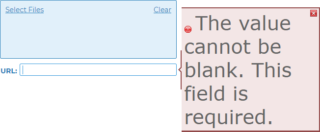
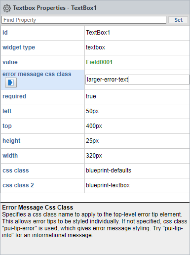
When making changes to your CSS files, are you making sure to clear your cache to ensure that the most recent CSS file is being used? Otherwise, this may mean that the order of the class application may be incorrect. You can try changing the name of your customized classes and entering the custom name in the 'error message css class' of the widget the error class is for. So, instead of 'pui-tip-error', you can use 'larger-error-text'.

- largeerror.png (14.76 KiB) Viewed 1402 times
Code: Select all
/* Styling for error/validation tips */

.larger-error-text.pui-tip {
  z-index: 999;
  cursor: pointer;
  background-repeat: no-repeat;
}

.larger-error-text.pui-tip .pui-tip-content {
  max-width: 250px;
  min-width: 150px;
  color: #666666;
  font-family: verdana, arial, sans-serif;
  font-size: 40px;
  white-space: normal;
  padding: 5px 25px 5px 5px;
}

.larger-error-text.pui-tip.pui-tip-top {
  background-position: bottom center;
  padding: 0px 0px 7px 0px;
}

.larger-error-text.pui-tip-top .pui-tip-content {
  border-style: solid solid none solid;
  border-width: 2px 2px medium 2px;
}

.larger-error-text.pui-tip-top .pui-tip-close,
.larger-error-text.pui-tip-top .pui-tip-close-click {
  top: 4px;
  right: 5px;
}

.larger-error-text.pui-tip.pui-tip-bottom {
  background-position: top center;
  padding: 7px 0px 0px 0px;
}

.larger-error-text.pui-tip-bottom .pui-tip-content {
  border-style: none solid solid solid;
  border-width: 2px 2px medium 2px;
}

.larger-error-text.pui-tip-bottom .pui-tip-close,
.larger-error-text.pui-tip-bottom .pui-tip-close-click {
  top: 8px;
  right: 5px;
}

.larger-error-text.pui-tip.pui-tip-left {
  background-position: right center;
  padding: 0px 7px 0px 0px;
}

.larger-error-text.pui-tip-left .pui-tip-content {
  border-style: solid none solid solid;
  border-width: 2px 2px medium 2px;
  padding: 5px 5px 5px 25px;
}

.larger-error-text.pui-tip-left .pui-tip-close,
.larger-error-text.pui-tip-left .pui-tip-close-click {
  top: 4px;
  left: 5px;
}

.larger-error-text.pui-tip.pui-tip-right {
  background-position: left center;
  padding: 0px 0px 0px 7px;
}

.larger-error-text.pui-tip-right .pui-tip-content {
  border-style: solid solid solid none;
  border-width: 2px 2px medium 2px;
}

.larger-error-text.pui-tip-right .pui-tip-close,
.larger-error-text.pui-tip-right .pui-tip-close-click {
  top: 4px;
  right: 5px;
}

.larger-error-text.pui-tip .pui-tip-close,
.larger-error-text.pui-tip-close-click {
  display: inline-block;
  background-repeat: no-repeat;
  width: 16px;
  height: 16px;
  margin: 0px;
  padding: 0px;
  position: absolute;
}

.larger-error-text.pui-tip .pui-tip-icon {
  display: inline-block;
  background-repeat: no-repeat;
  width: 16px;
  height: 16px;
  vertical-align: text-bottom;
  margin: 0px 5px 0px 0px;
}

/* Error/validation tip skins */

/* Error */

.larger-error-text .pui-tip-content {
  background: #F3E6E6 none repeat scroll 0 0;
  border-color: #924949;
}

.larger-error-text.pui-tip-top {
  background-image: url("/profoundui/proddata/images/validation-arrow-bottom.gif");
}

.larger-error-text.pui-tip-bottom {
  background-image: url("/profoundui/proddata/images/validation-arrow-top.gif");
}

.larger-error-text.pui-tip-left {
  background-image: url("/profoundui/proddata/images/validation-arrow-right.gif");
}

.larger-error-text.pui-tip-right {
  background-image: url("/profoundui/proddata/images/validation-arrow.gif");
}

.larger-error-text .pui-tip-close {
  background-image: url("/profoundui/proddata/images/buttons/close/x5.png");
}

.larger-error-text .pui-tip-close-click {
  background-image: url("/profoundui/proddata/images/buttons/close/x5_click.png");
}

.larger-error-text .pui-tip-icon {
  background-image: url("/profoundui/proddata/images/icons/exclamation.png");
}

.larger-error-text-invalid {
  background-image: url(/profoundui/proddata/images/invalid-underline.gif);
  background-repeat: repeat-x;
  background-position: bottom;
  border-color: #924949;
}

- largererrortext.png (18.75 KiB) Viewed 1402 times
Thanks!
Re: error message css class
Posted: Mon Jul 09, 2018 8:24 am
by mwalter
Thanks Megan. I'll give that a shot.
Re: error message css class
Posted: Mon Jul 09, 2018 8:31 am
by mwalter
Perfect. Thanks Megan.